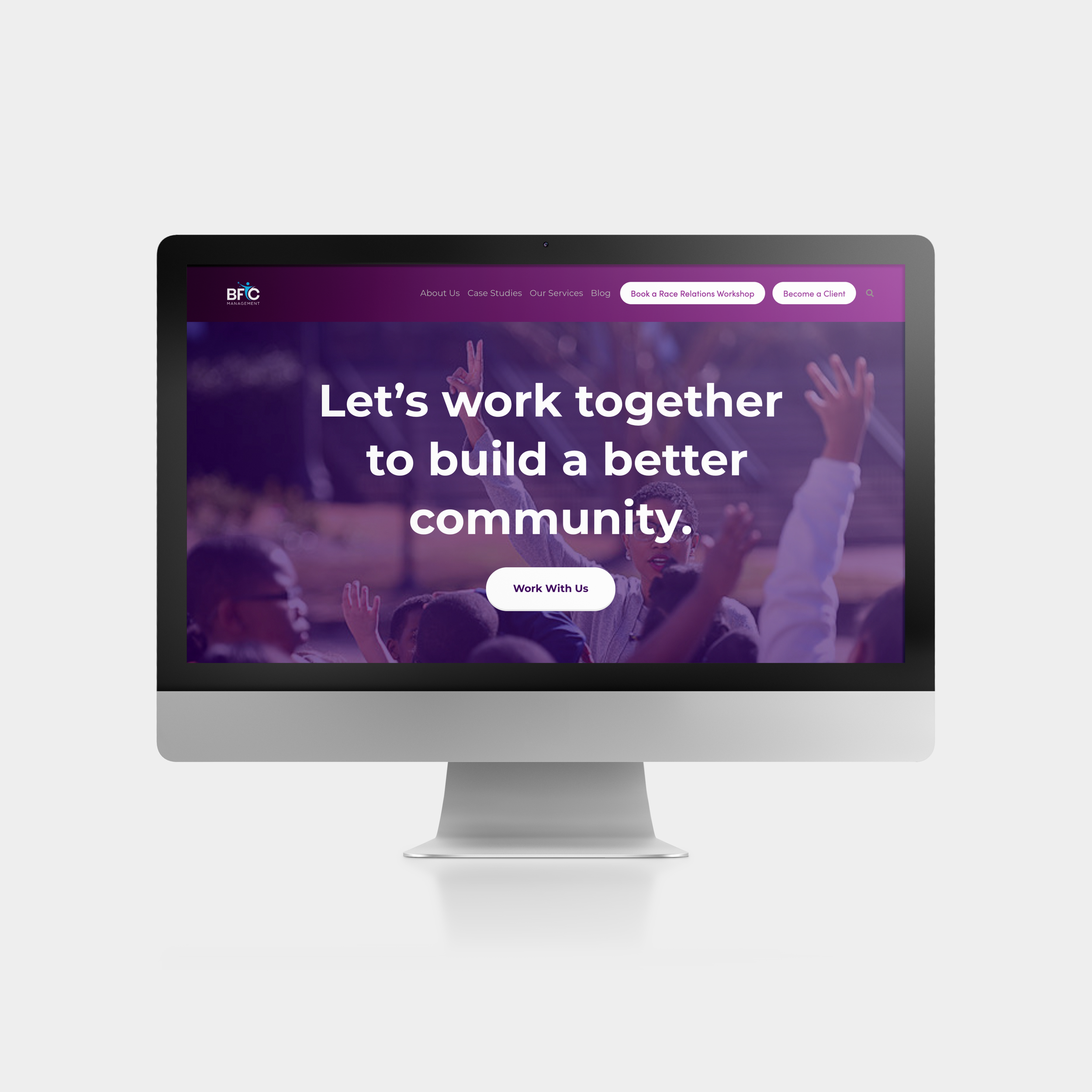
BFC Management
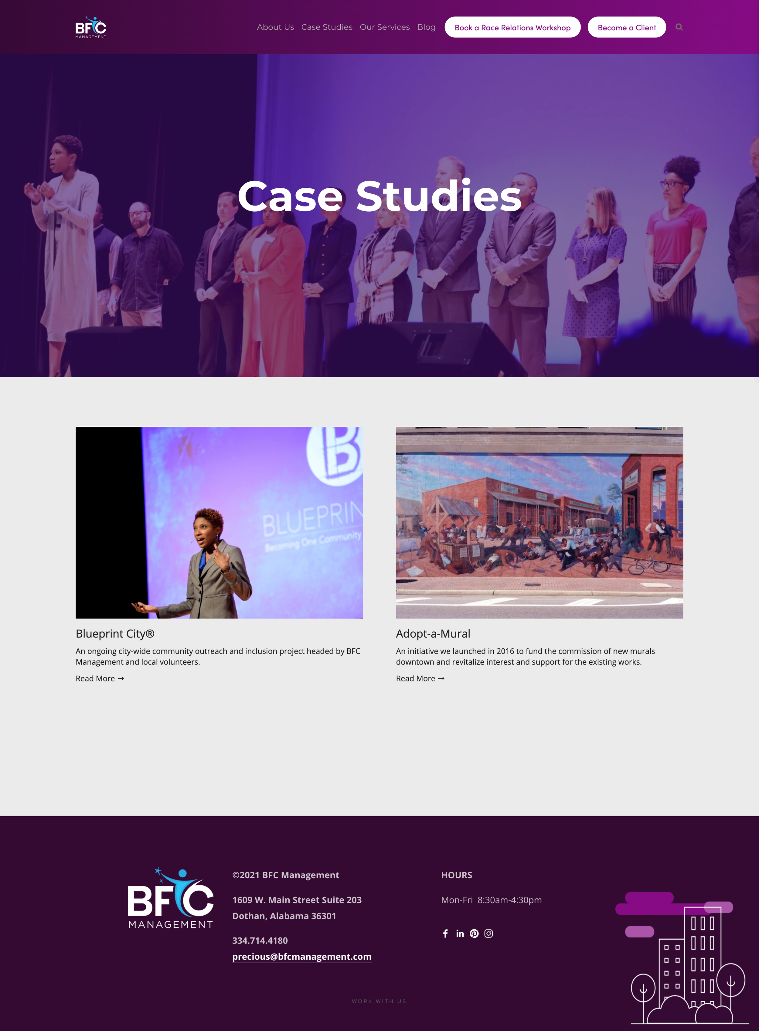
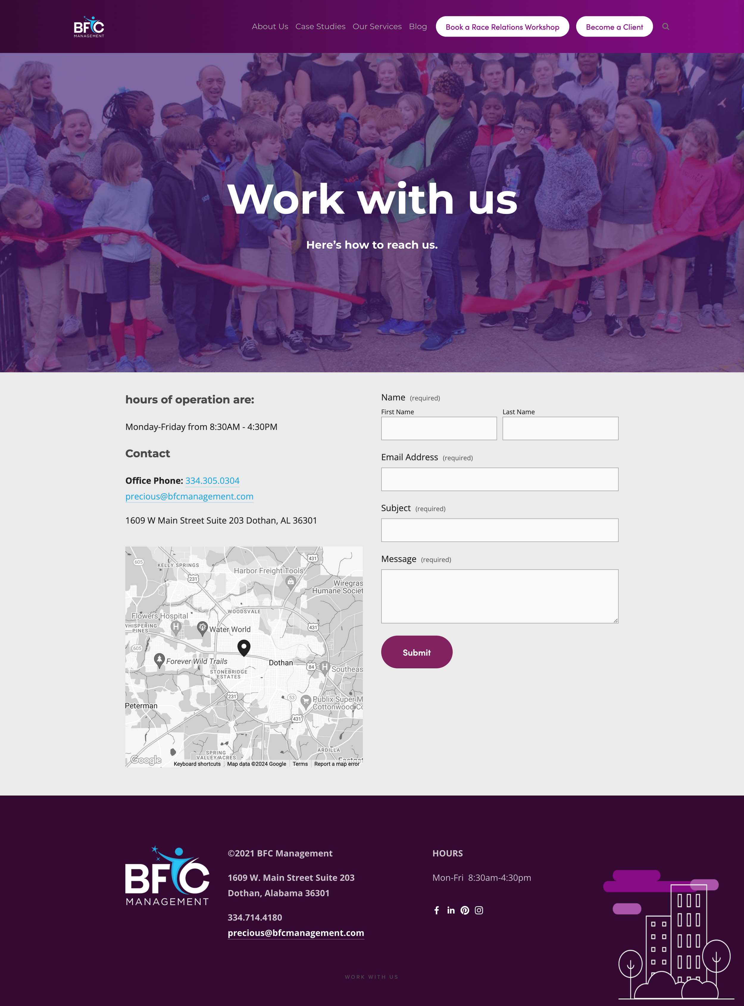
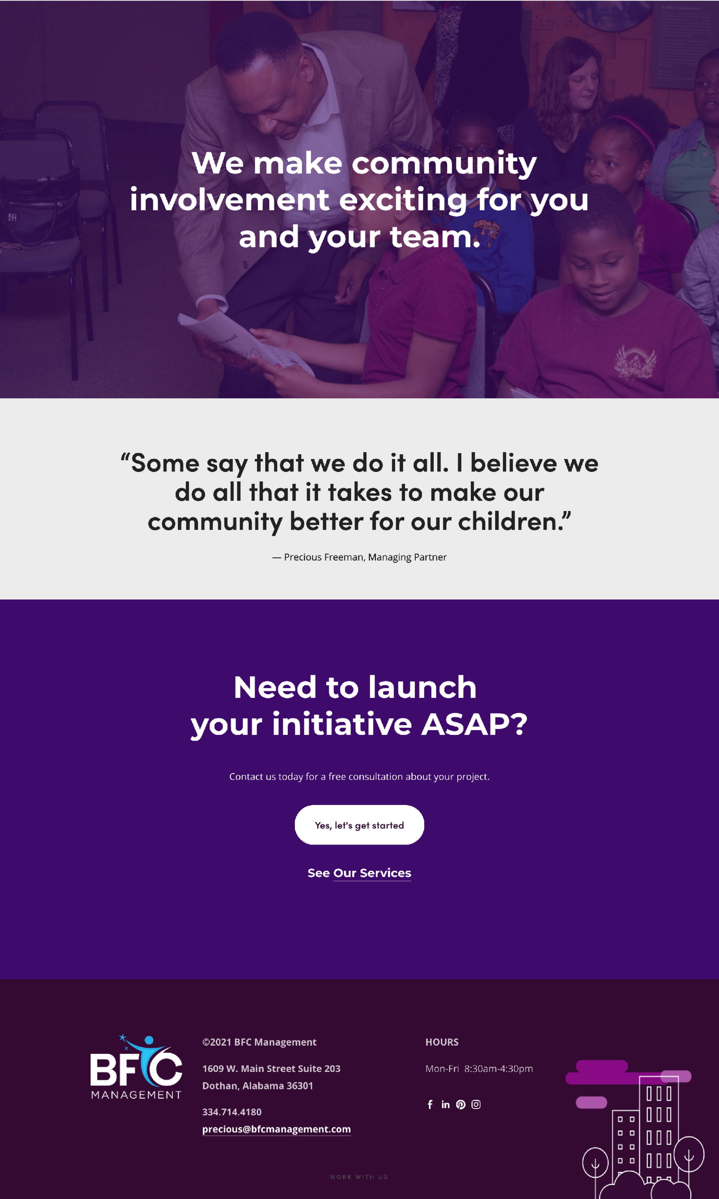
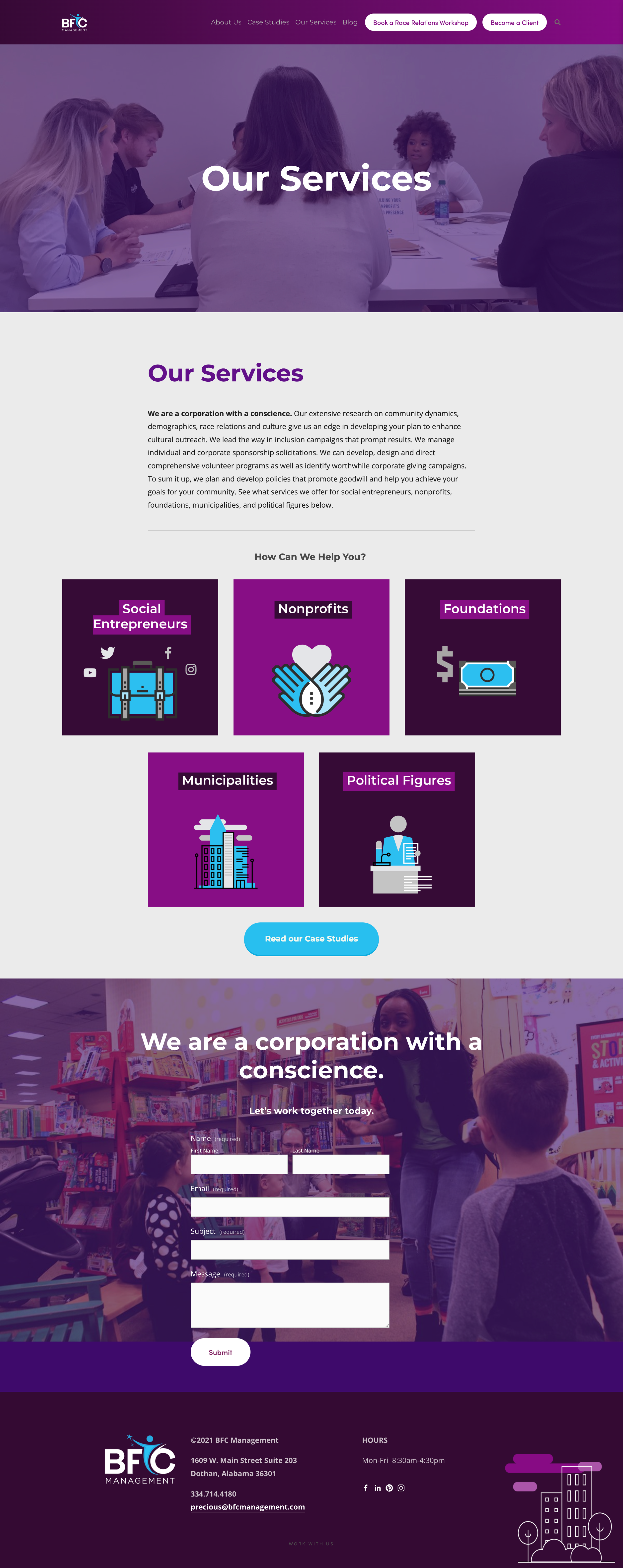
Client: BFC Management is a Community Relations and Nonprofit Consulting firm comprised of open-minded innovators who are passionate about bringing communities together.
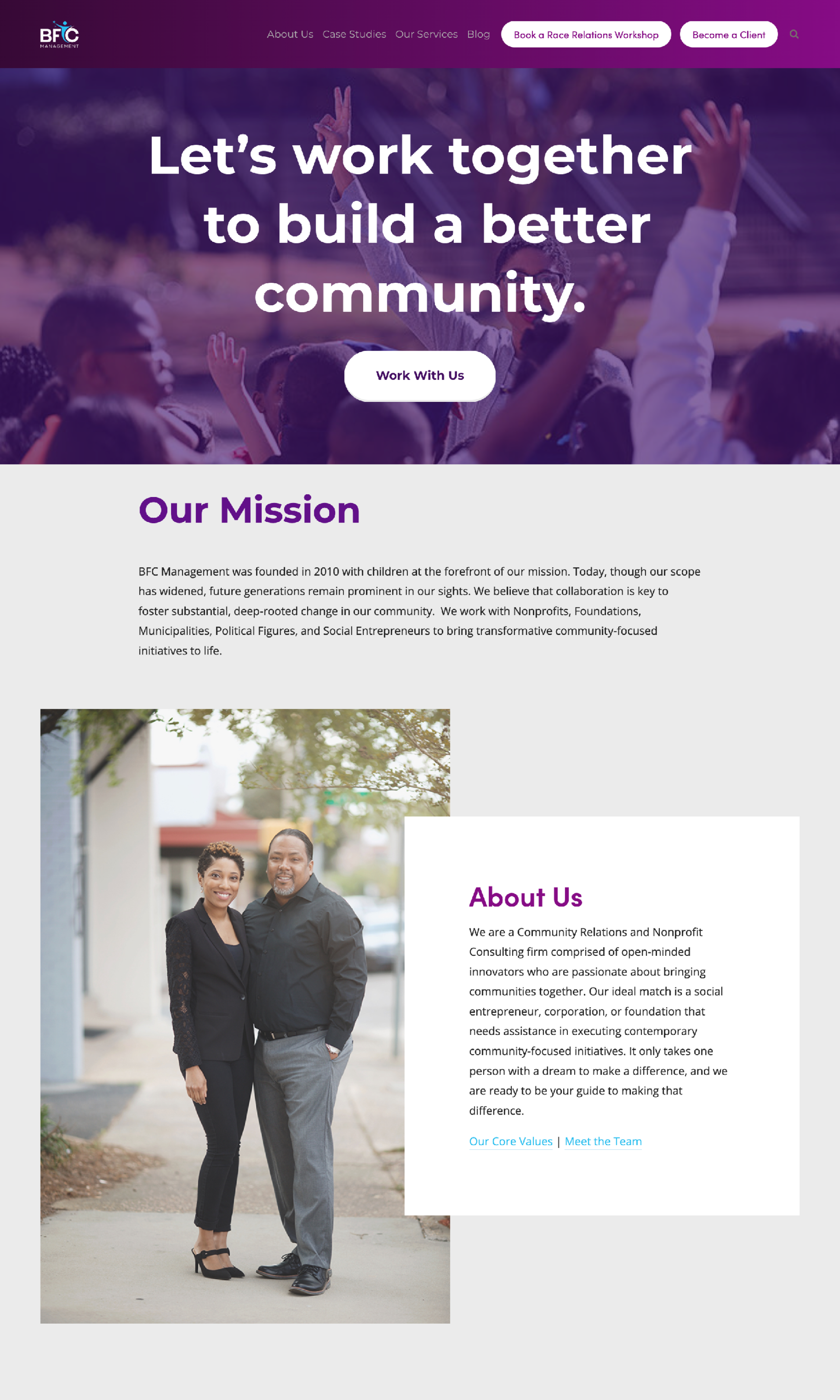
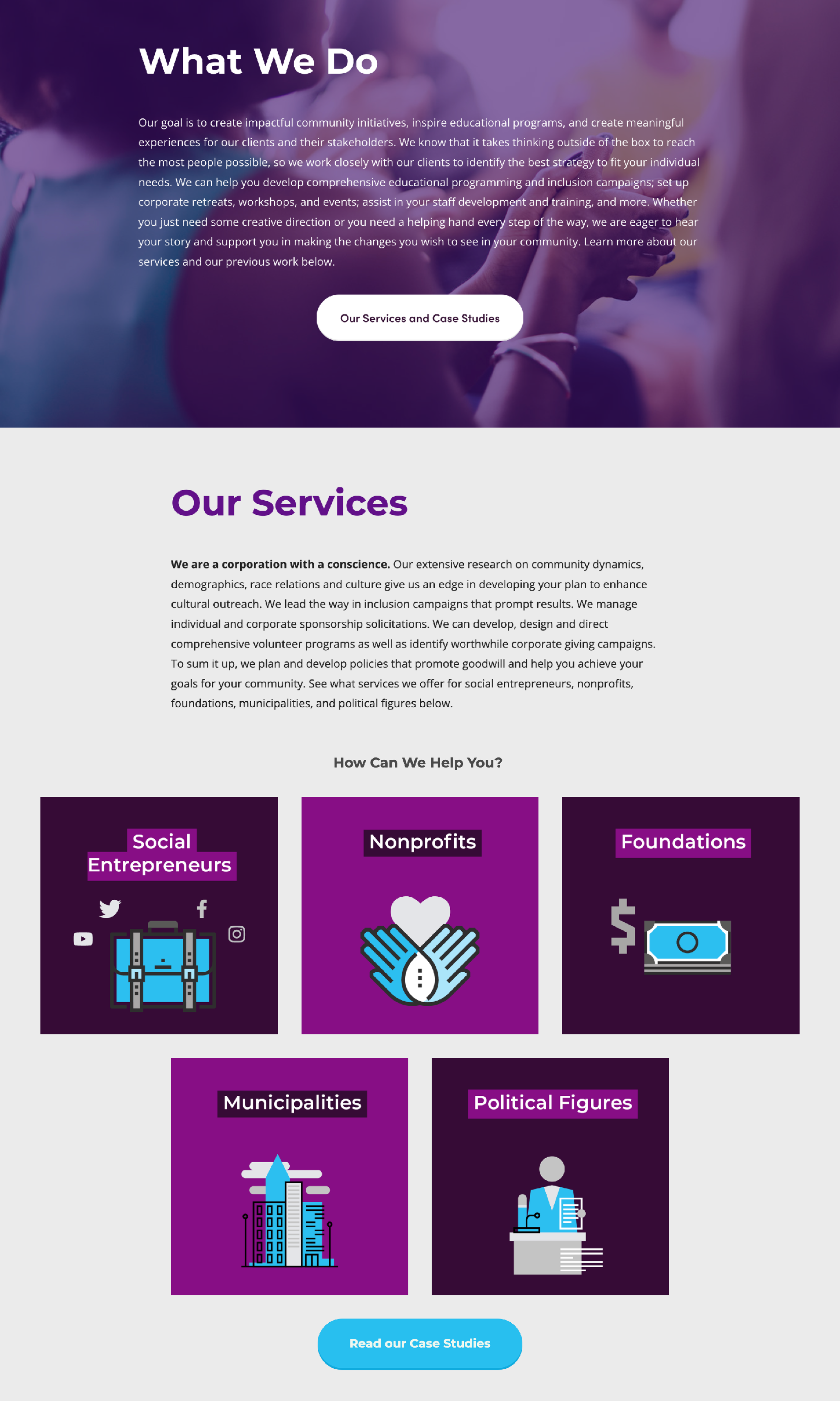
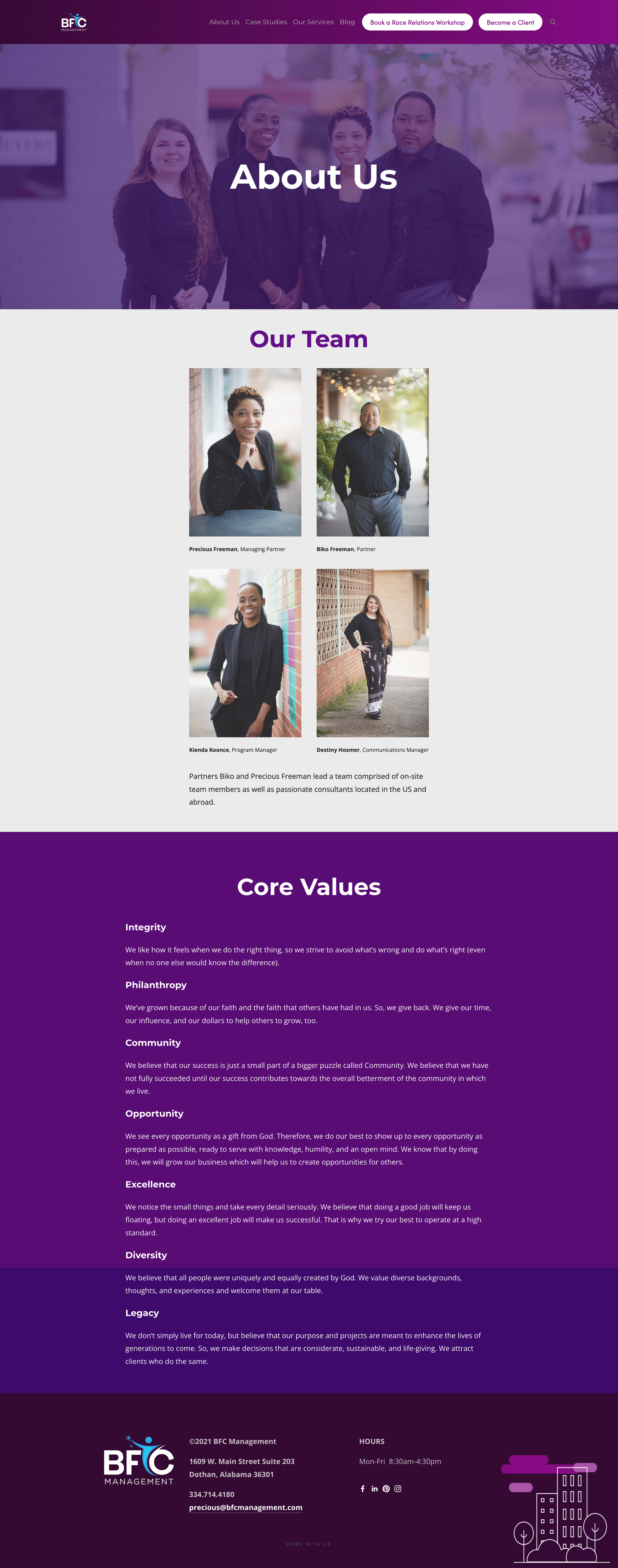
Project: Branding and UI/UX design for new BFC Management’s new website.
Pages and interior sections
Creative Besties
A real-time, live 1-on-1 Design Mentorship Program with remote sessions via GoToMeeting (the Zoom before the Zoom).
Urban Greens Juice Bar
The challenge
Create a brand and materials for Urban Greens Juice Bar — a raw juice bar in Mills Creek, WA. This was a brand new business so we needed everything from a logo to signage to emenus and juice labels.


Bible Study Made Easy
Sales page, branding and marketing materials for an online bible study course. Marketing materials include social media covers and graphics for video. Course materials include quizzes and modules. Course is accessible on desktops and mobile devices.


Facebook page cover

Facebook group cover


Worksheets for course
Wait — there's pink peacocks now?
Oh MY. ❤ And the colors work beautifully with the pavonated ones. What will kids these days think of next?!
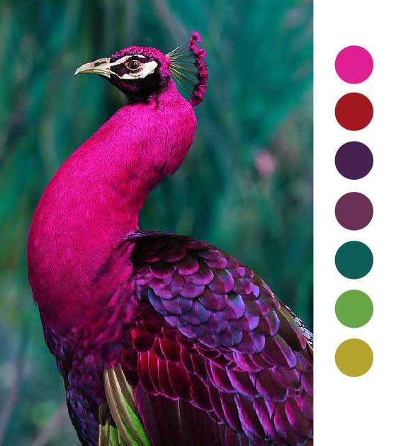
Pavonated: The majesty of the peacock
I don't love blue tones the way other people do. I think all of the generic technology and staffing firm logos with the futuristic ambiguous "swoosh" forms and globe shapes ruined it for me. However, I don't think I'll ever get past the beauty of the combination of this bright, saturated blue, the dark greens and that tart gold. Love.




Pointy letters
Last year my type thoughts were consumed with handwritten type lettering, but Squarespace's release of the Marquee template gave me a really renewed appreciation for Futura at normal and medium weights.
I've come to realize, it's the sharp, pointy capital letters. So here's my roundup of faves in terms of pointy factor. I love a nice SHARP point.

While Futura Medium technically may have more point than Frontage-Regular, where Frontage excels is in the fact that it retains the pointiness in Frontage-Bold. Once Futura gets bold it totally loses that.
When I first saw MTT Milano a few weeks ago, my heart actually sank a little because I felt like I was cheating on Frontage (I never feel like I cheat on Gotham, which I'll post about later). But I soon came to realize that while they're VERY similar, there's a place in my heart for both of them.
While Frontage as a family was created to be layered, it doesn't have a weight as thin as Milano. Or, lowercase letters. And it has an E that *I* think is cool but might be a little too novel for casual use. I modify it in certain instances. So:
Frontage Pros:
- Pointy
- Family made for layering, which is COOL
- Regular and bold weights
Frontage Cons:
- Funky E
- VERY wide kerning
MTT Milano Pros:
- Lowercase letters
- Normal E
- Normal kerning
MTT Milano Cons:
- Only one thin weight
- Not *quite* as much character as Frontage
But, bonus love for the uppercase W.
Look out for the upcoming Frontage vs. Milano love battle. <3

Futura Heavy — notice the blunted points.
Left: Frontage-Regular, Right: MTT Milano. One largely distinguishable difference. I think the funky E is cool, but too novel for some circumstances.
MTT Milano: I AM a sucker for that W, though.

I'm a designer in Texas with 20 years experience designing brand projects for the media, advertising and marketing. I'm trained across several disciplines. I've done print, designed ebooks, newsletters, physical products like candles, mobile and social media design, and I’m now I’m leveraging the power of AI.