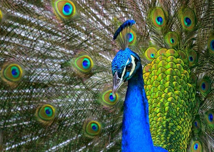
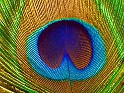
Pavonated: The majesty of the peacock
I don't love blue tones the way other people do. I think all of the generic technology and staffing firm logos with the futuristic ambiguous "swoosh" forms and globe shapes ruined it for me. However, I don't think I'll ever get past the beauty of the combination of this bright, saturated blue, the dark greens and that tart gold. Love.


