Storytelling + UX Writing + Content Design
WellCall360™
The Challenge
Forbes dubbed Hooray Health “the alternative to Obamacare” for their affordable, fixed indemnity healthcare plans. Hooray’s new offering was a stand-alone telemedicine app and prescription discount program.
My role: Conceptualization of the marketing story, UX writing and design of the app, the enrollment landing page, and social media graphics.

The Problem:
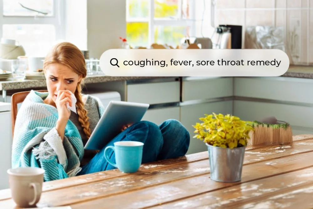
“Dr. Google” is not
board-certified.
Still, there’s been a sharp rise over the years of sick people using search engines to self-diagnose and treat.
Our campaign leveraged WellCall as an affordable way to get treatment from a board-certified, licensed physician in minutes.

Branding:
Look & voice
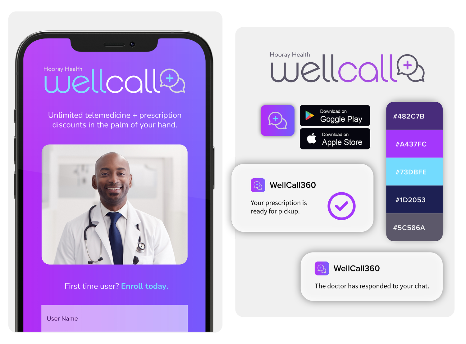
Look: I kept the logo modern and simple, with a nod to text messaging, as a significant segment would rather communicate via text message and didn’t realize this was an option. I also integrated the purples and rounded corners of the parent brand, Hooray Healthcare, since WellCall would likely be sharing assets to get to market quickly.
Voice: Conversational, casual, lifestyle language and photography with no jargon.
Data & Market Research:
Audience and pain points
Valuable insights into who made up our target audience and why.
Workers. Gig workers , part-time workers without benefits, service workers, and freelance workers know getting sick could mean not getting paid.
Parents. Even for stay-at-home parents, getting small children ready to leave the house can be a frustrating and time-consuming task when someone is sick. WellCall also offered the added convenience of an opt-in to Rx Valet, which would deliver prescriptions directly to your home from the pharmacy.
Travelers. Getting sick while traveling isn’t uncommon, and WellCall offered 24/7 nationwide telemedicine. The prescription discount finder can locate the best price for your medicine in the area, too.


Overarching story:
Storytelling across channels
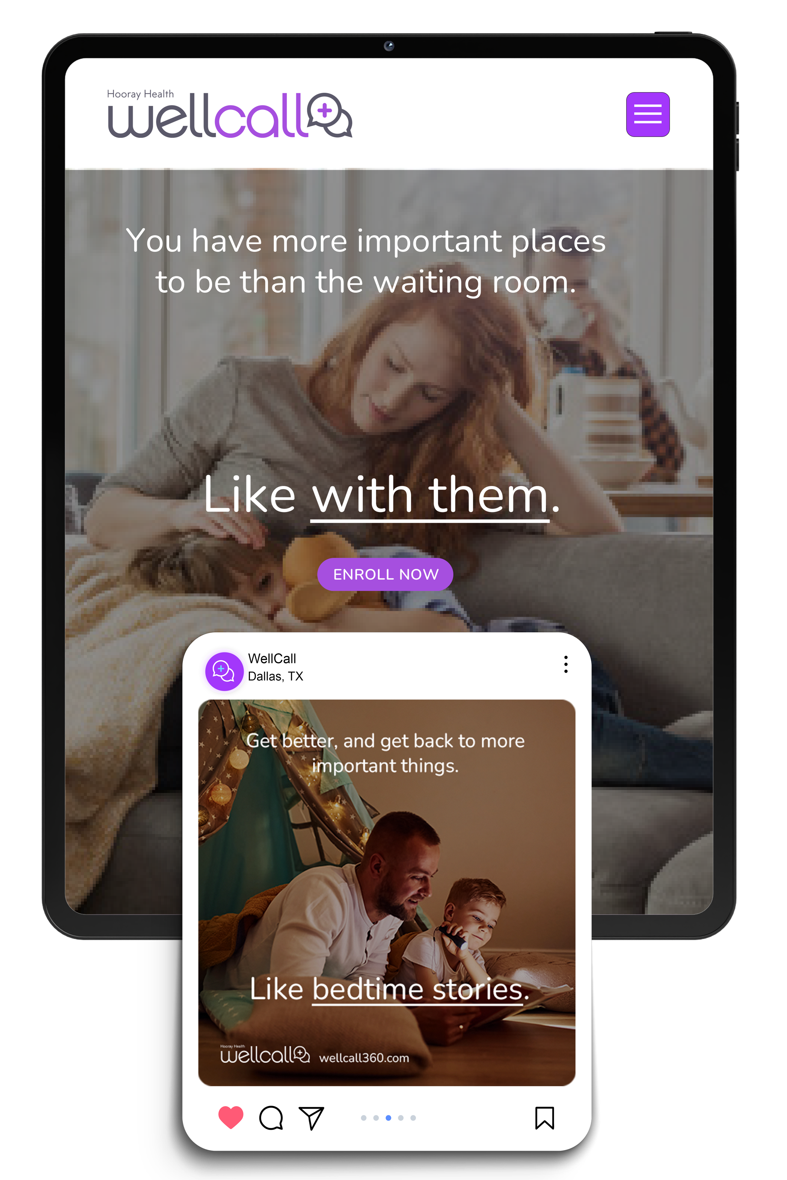
Story concept: Getting sick keeps you from the things that are important — get better so you can get back to the things that matter. The website and social media were designed to work together to tell this story in tandem.


App:
Walkthrough design & prototyping
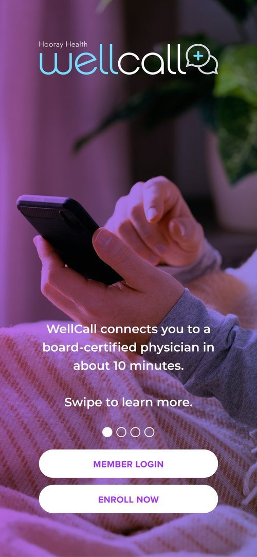
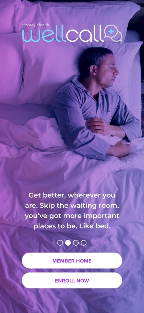
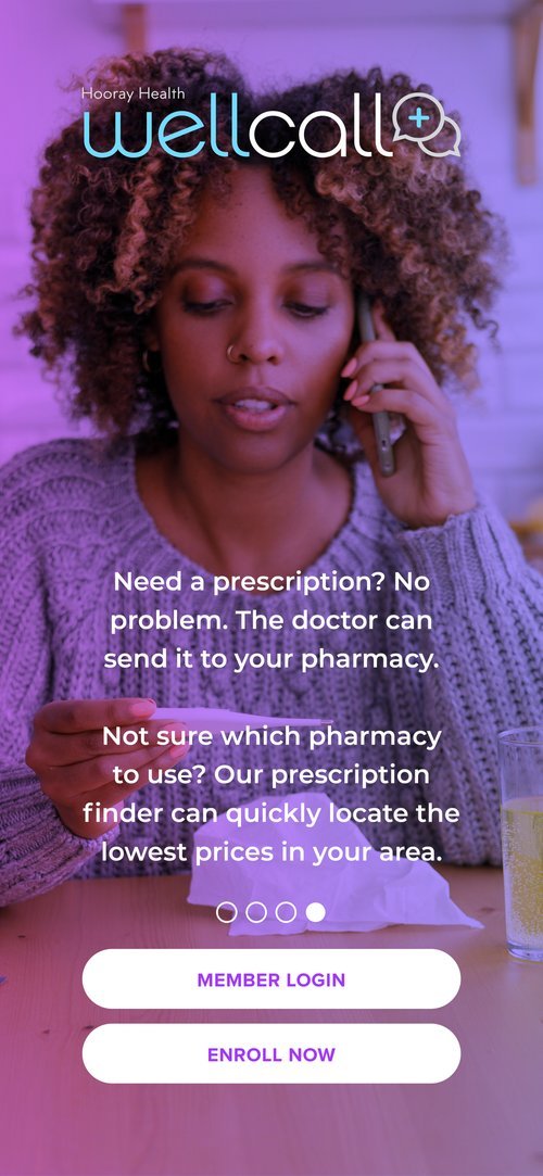
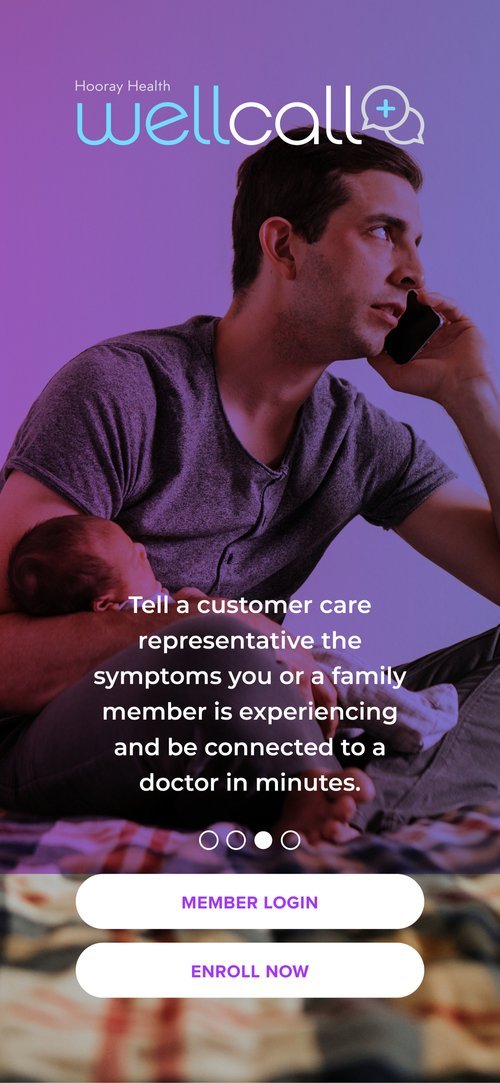
I designed and wrote the walkthrough screens for first-time users to introduce them to the app.
I also designed pages for the app’s prototype, piggybacking off the parent app to minimize time to market. Because we needed to launch very quickly, I essentially created a “wrap” for the app that already existed and was in use.
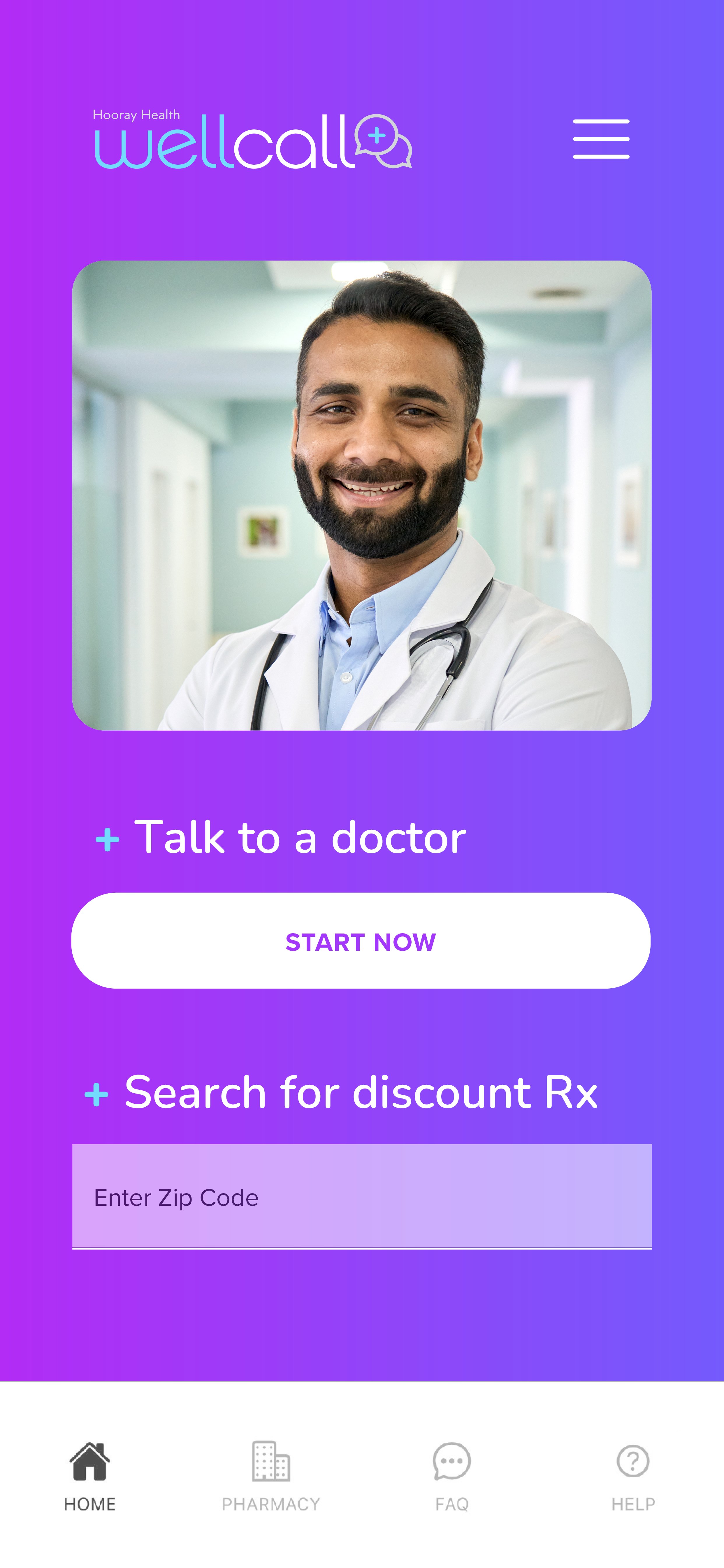
Click through the view.
Completing, testing, growing:
Supporting social media story themes
I collaborated with our Social Media Director & Copywriter to craft three branded visual topic subjects to further grow brand messaging recognition as well as for A/B testing. (He did the research and wrote the copy here, I simply designed the graphics. 😊 )
We did the math.
A month of WellCall was about the same price as a Chipotle burrito with guac.
User scenarios.
Inspired by users of Hooray’s existing telemedicine feature.
Surprising facts.
Even with insurance, many Americans in rural areas don’t have easy access to healthcare.
Closing thoughts:
The power of the human experience

I often feel like lifestyle photography is considered less professional than the typical “business people collaborating” stock art, but it’s a really overdrawn concern in my experience.
I presented this social media graphic in a meeting, and it was met with an audible “awww” — in a room full of men of different ages who sell and market health insurance.
Every man in the room saw his daughter, sister, or niece in it. I don’t think that’s something people would predict without testing.

This one was very well-received too, and I think it’s the kind of micro story that could be dismissed as too “fluffy” to be serious. But the concept of what family looks like is changing, and pets just have a very different hold on us than they did 20 years ago.
These two in particular were good reminders to not become fixated on what a lot of people believe a business vertical like health insurance should look like.
