The Venn diagram of design headaches
Frustrating places to be on the great diagram
They're actually REALLY common. I can help you avoid them.
Over the years I feel like I've that noticed an understanding of how design, technology and content work together are key in creating products, services and ideas that sell vs. brands chock full of WTF. And you really need all 3 to make it work. Any combination of the other 2 throws the whole operation off.
I use these thoughts while designing to help ensure what I'm doing is boosting sales, profit or productivity for my clients. Let's take a look.
First, let's talk about some misconceptions:
Technology, unfortunately, is not magic. Things like creative software, CMS, programming and devices are tools that help us build from good ideas.
Design isn't just about making things "pretty," it's about creating a connection with your audience and crafting a user experience that they want to buy.
Content IS king...but selling it is hard to do in a vacuum. Your ideas and writing need to be compelling, visually engaging, and easy to buy or find.
Now, these are the combination pockets in the diagram that rarely work and that you want to avoid sitting in.
If you never have to struggle with this, my job is done. Thank me later. :^)
1. DESIGN + TECHNOLOGY
This combination is especially seductive. The latest bell and whistle is exciting, especially when it LOOKS great, too. But without strong content it often lacks purpose, and you may find yourself with a product that's like the answer to the question nobody asked.
2. DESIGN + CONTENT
This combination creates things people LOVE to read and use. If it can be produced, and if they can find it. Truly compelling and engaging products that would fly off shelves are created in this space — but in a growingly digital world, people can't buy these things if they can't find them, or find you, or if buying or ordering them is hard and confusing.
3. TECHNOLOGY + CONTENT
Truly frustrating. A business owner will sometimes have a fully functional Wordpress site and they've got all the right plug-ins and actually love creating content — so why isn't it working? Why is nobody using the opt-ins? Isn't Wordpress all the rage? There's obviously exceptions to this rule, but people commonly decide how trustworthy your brand seems within seconds. Take a really good look — do you truly look credible? Would you trust your website with your credit card information?
4. WHERE MAGIC LIVES, IF SUCH A THING TRULY EXISTS.
Design + Technology + Content is the recipe for creating viable, professional, profitable products and services. Great design, compelling content, and easy ways to find your business online leaves room for unlimited potential. Leaving out one of these key elements is the difference in turning a product someone grimaces at with confusion into a product that people are actually excited to hear about and ready to buy.
If you happen to be in pocket 4,
congrats!
It's a good place to be. :^)
Fun with stock art, Part 1
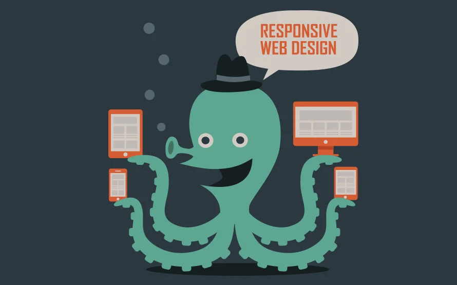
So, for whatever reasons I searched for vector art related to responsive web design the other day, and I was NOT prepared for the search results.
Gaaaahhhhh. So MUCH CUTE.
OF COURSE this guy needs all those arms for all his widdle devices. ❤
His little hat is pretty close to killing me. In the best of ways. ☺
Score this guy at Shutterstock.
And apparently the family that's mobile responsive together, stays together. I bet the smaller devices are KIDS. Eh? I know. <3 I'm going to be so disappointed when the family's true story is ripped from the headlines and turned into and episode of SVU.
Snag 'em while they're still wholesome at Shutterstock.
I'm a designer in Texas with 20 years experience designing brand projects for the media, advertising and marketing. I'm trained across several disciplines. I've done print, designed ebooks, newsletters, physical products like candles, mobile and social media design, and I’m now I’m leveraging the power of AI.


