99 FAILS
My social experiment: Are crowdsourcing contests REALLY cheapening our industry as professional designers?
No. Lack of taste is.
Which is probably due to us failing to educate our clients on the difference between good design and bad. Otherwise the experience was pleasant and I met some nice people.
Some of these, like the one below, paid over $900 for a logo with ultimate deliverables of lettterhead, a FB cover, biz cards, etc. I find that fair, and I liked the clients a lot. I had some time this week and entered a few contests. The cheaper the prize, the faster I was eliminated. But the way 99 design does their briefs isn't enough information to build a solid logo. So, here's my experience so far:
These were some of my many entries, several got 4 stars on a 5 star system. This first one I just missed the ability to post by like 45 seconds, and by my reasoning it would have solved all of our problems. But, I'm just a designer, so there's that.

Literally missed deadline by less than a minute. *sigh*
I don't think even extremely changing the color woulld have worked.
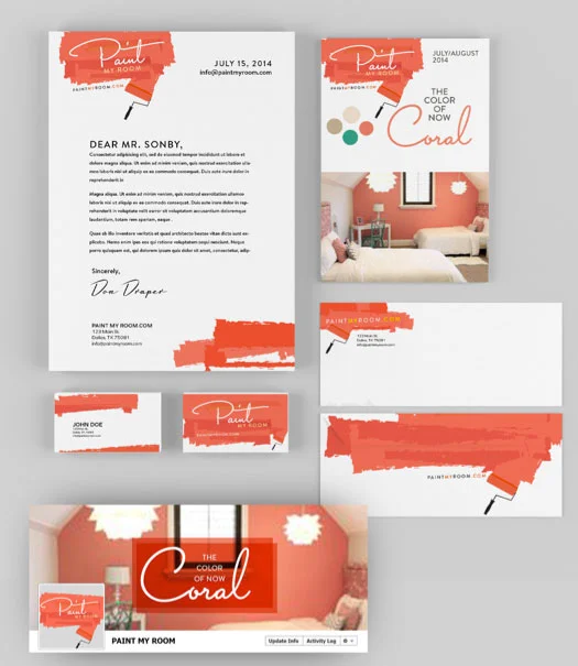
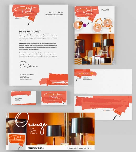
Yeah, it's a lot of coral, BUT....
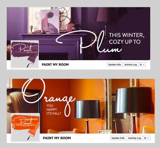
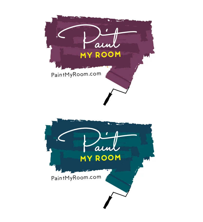
I tried showing him how FB could change easily with seasons, and recommended they go with Moo or something to get different colored paint biz cards for everyone, order the small batches every quarter.
I even offered less girly colors, but was assured the coral was great.
"I wish you would have at least tried the type face we suggested instead of telling us it just doesn't work. We understand that you have no way of knowing, but we are a team of five designers here with degrees in Graphics, Interiors, and Architecture, We all pretty much know how color works, size and scale of type faces and the mixing of the two. We were hoping with a bit of collaboration, and our input, that we could have pulled this off at the last minute. Needless to say we are all disappointed we didn't get to see results from our suggestions."
Well, no, Garamond didn't work. But yes, I DID enter it and pointed it out twice. The other font was a VERY light typeface similar to the ones in some other entries in which I used MTT Milano, a fairly thin face, in more purple and teal examples, but MUCH MUCH lighther/thinner. It probably would not have even printed properly. And yes, I've done print work for several years.

System fonts are forgettable.
I was told "ROOM" just needed red and/or blue or green to "make it pop." So, I did. It didn't "pop." It vibrated. Designers with degrees should know this. And I was specifically told this script font worked.

Overall, their feedback was awesome, very nice , VERY helpful, really liked my work supposedly, so I wondered who else got the 4 or 5 stars on their entries. Then they were all made visible.
The other 4 star guy I'd wondered about? This dude. Again, after contest holder telling me he wanted something elegant in the URL like, Garamond. No. Just, no. And there is NOTHING elegant about this.
So this is my competition.
I don't know how this makes me feel.

"We know we do not like a distinctive Rainbow effects, or just the use of primary colors, we like bright and distinctive colors that have shading variations. After all this web site will be about the subtlety of all colors. Thanks for your question, it is a very good one. "

But then these got decent reviews, and then this happened::

It was well-reviewed.
Ironically, these were the first 2 entries to the contest. And now that paint splatter cluster will win.
Do people not...have...eyes?
$200 dollar contest, wanted a "friendlier" logo and wanted to be known as Bengstson's Pumpkin Farm. This is the original.
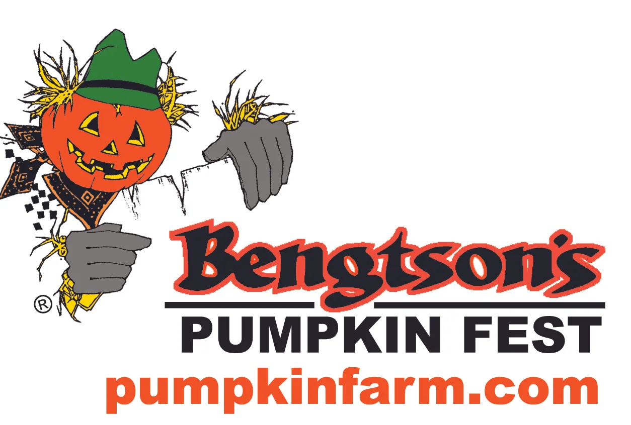
What? It's not friendly?
Within minutes I was eliminated LOL.

Luxury, high brow client who makes high-end custom jewelry. $200. Again, eliminated within about 4 or 5 mins. LOL. I even added a diamond at the last minute but can't find it. Oh well.
This was mine:

Get your biz card letterpressed and nobody will EVER question that you're highbrow. I even entered one with a diamond but can't find it..
This got 5 stars and reminds me of a project I did in high school.
A very bad one. 10 bucks says she has it printed at Vistaprint. I mean, great service, but not for something THIS high end.
